He was born on September 8, 1952 in Corpus Christi, Texas. Carson and his family moved to New York City four years later. And since then he has traveled all around the world but has maintained New York as his base of operations. Carson now owns two studios; one in Del Mar, California and another in Zürich.
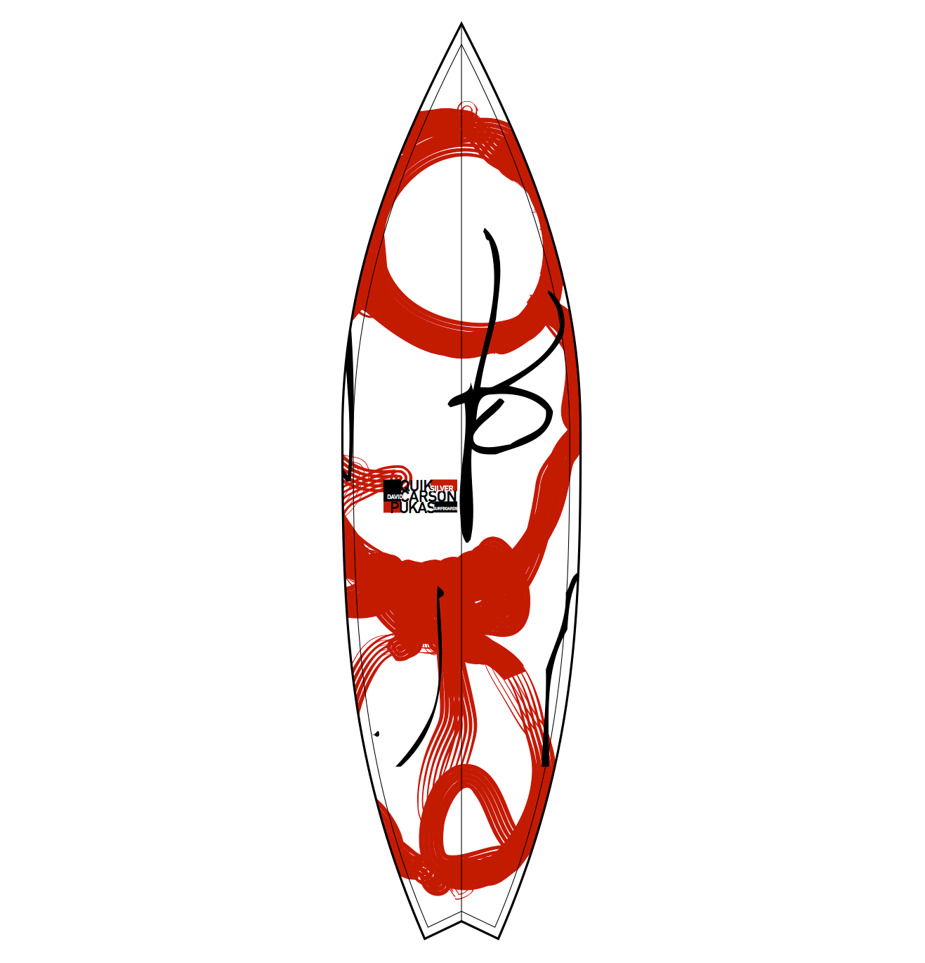
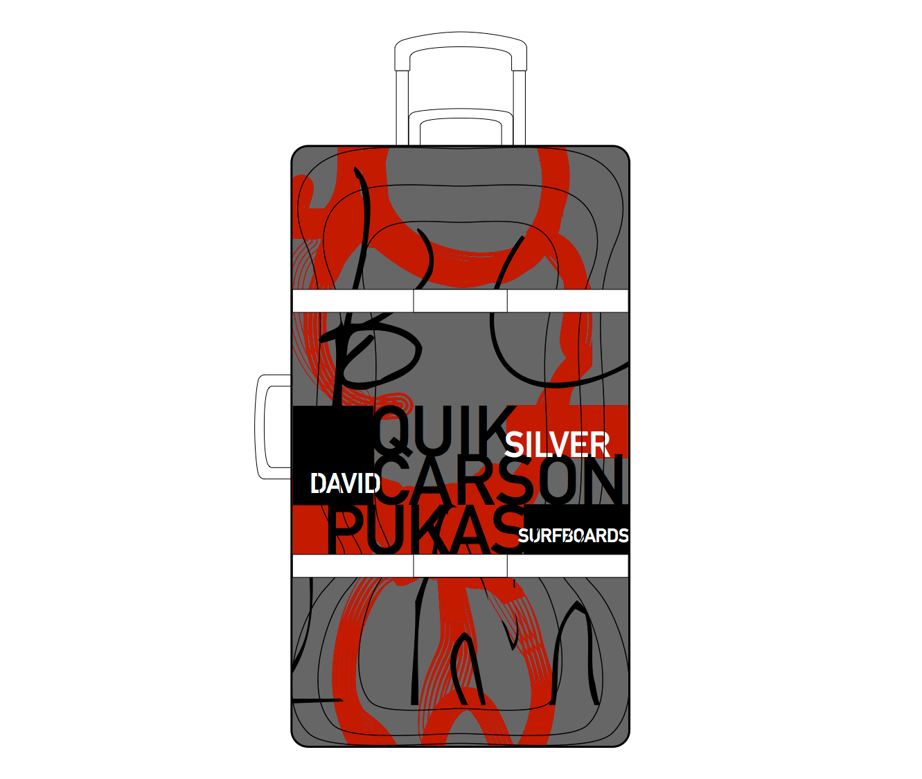
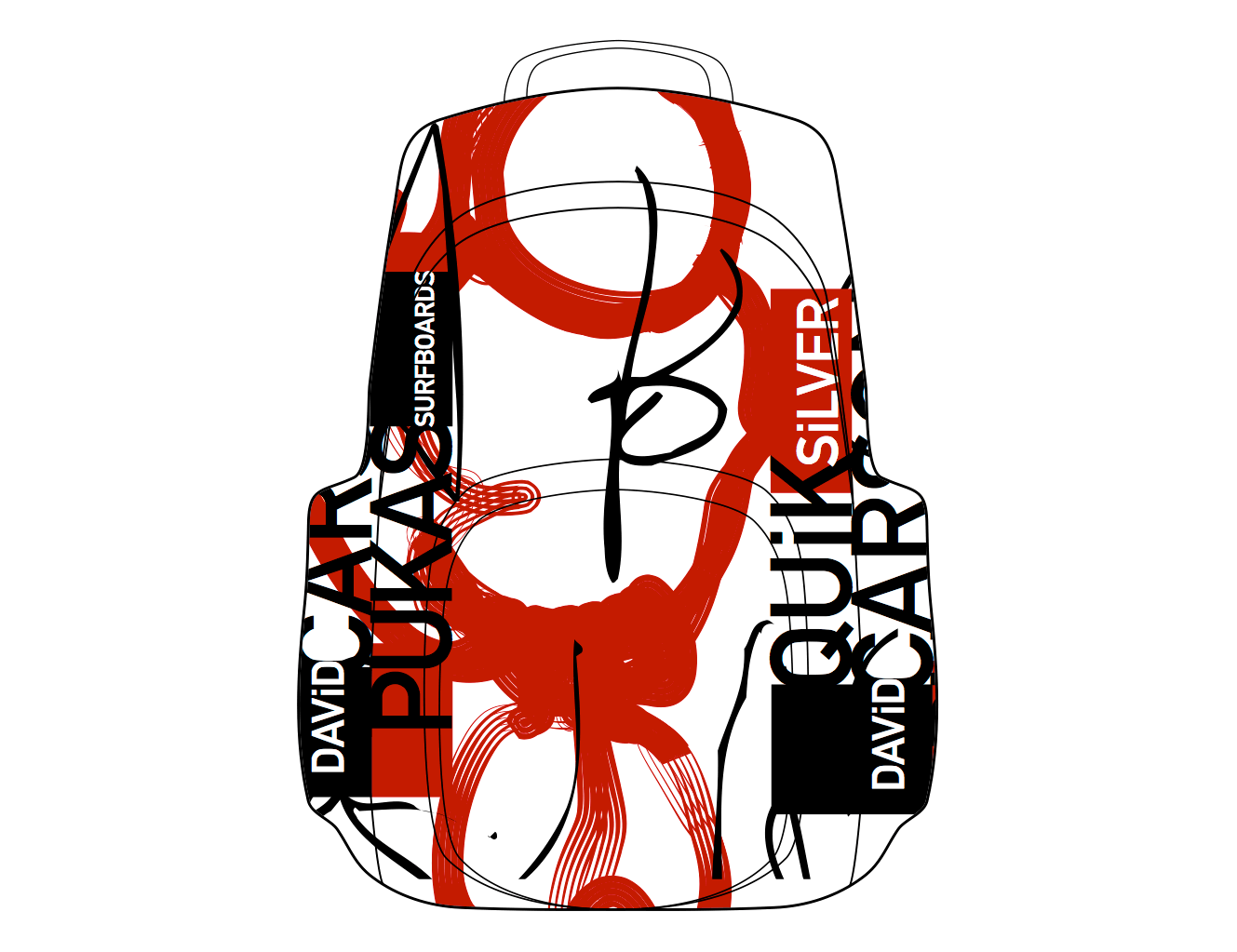
One of his latest artwork that I enjoyed is his designs for Quicksilver luggage. david is collaborating with quiksilver and pukas surfboards in europe for a line of carson designed luggage, backpacks, surfboards, wallets and more, available at over 600 stores in early 2010. What enjoy about the work is that he incorporates surfboarding into the luggage by using the same design.
Cited Sources:
 Janine Rewell is a Helsinki-based illustrator and graphic designer. She studied graphic design at the University of Art and Design Helsinki and Rhode Island School of Design. Janine won the bronze Design Lion at the Cannes Lions International Advertising Festival 2009 and recently nominated by Print Magazine as one of the twenty best new visual artists of 2010. She is also awarded with the Junior Award 2010, the greatest national recognition for a young designer. In addition to taking part in many group exhibitions, she had her first solo exhibition in Barcelona in 2010. Inspired by surrealist painters, children's books, art deco, bright colors and the geometry of nature, Janine's designs are a enchanting mix of Scandinavian design and Slavic folk art.
One of Janines most successful pieces of work that I enjoy is her Illustrations for Nokia's Christmas campaign. Nokia Christmas campaign is annual competition which allows designers to bring together the spirit of Christmas and technology. Janines artwork won first place in 2009 and her work was displayed in the Wieden & Kennedy London magazine.
What I think of her work is that she compiles all of her ideas into on area which draw you into the artwork and makes makes you look closely to the piece to actually see whats going on. The design really has a Christmas feel to it by using familiar color and objects that relate to the occasion. when putting these backgrounds be hind Nokia cell phones they give them a gift-wrap present type presence.


Cited Sources:
 My last designer is Jason Schulte. Jason Schulte is the founder and creator director of San Fransisco based "Office". Jason founded Office in 2003, and his primary goal was to introduce the art and craft of design with strategy and storytelling of advertising. Since then Schulte has made work for some oft the worlds most recognized companies, including Ebay, Coca-Cola, Apple, Disney, Target, and Adidas Golf. His work has been Internationally recognized by nearly every major graphic design competition and publication, and has appeared in museums exhibitions around the world. Schulte is also a directed study advisor at the San Francisco Academy of Art University, and Fast Company featured him as one of fourteen designers to watch in its Master of Design issue. He was raised in Green Mountain, Iowa and is a graduate of Iowa State University's College of Design. He lives in San Fransisco with his wife Jill Robertson who happens to be Office President.
Some of his work that I truly enjoy is Fanta World advertising campaign for Fanta one of the most popular sodas around the world. The Fanta team recognized that teens today are "global experience collectors," willing to try whats new in Tokyo or Sao Paolo. So they launched Fanta World - new brand that introduces teens to limited edition Fanta flavors around the world.
Office developed the new packaging system for Fanta World, aligned with the Fanta trademark system. Consistent with Fanta World’s adventurous spirit, the visual vocabulary evokes a sense of discovery. Each product – from Thai Mango to China Melon – has playful illustrations that identify the country and flavor. And the packages have a collectible feel to emphasize the limited time availability of each flavor.
What I think about his work is that that design definitely draw more of a teenage audience, by using vibrant color and playful pictures. But the key to the design was to use artwork that is familiar with the audience that is directly related to their Asian culture such as the use of the China Lion and China building structures.


Cited Sources:
2)
No comments:
Post a Comment