Monday, April 25, 2011

CR02

This class period is very interesting and as we watched William McDonough on
.

I want to focus this post on my three favorite concepts from Cradle to Cradle : that we can create a world of abundance, that waste equals food, and that products of service can be a useful way to make goods which are more eco-conscious.

First of all, a world of abundance refers to a planet filled with products that celebrate culture, improve the economy, and have ecological benefits. How wonderful would it be if environmentalists and industrialists could both encourage vehicle production, because old cars could be 100% recycled, and new “nutri-vehicles” would not only not pollute, but would also purify the air and provide drinking water.

As someone who loves nature and wants to protect it, I really like the idea that I don’t necessarily need to make sacrifices such as driving less, buying less, and not having children. We need to foster a society where all professionals have the same aspirations so that skills can come together to create a world of economic prosperity while safeguarding our culture and resources for future generations.

Sunday, April 24, 2011

Journal 04 (J04): Found Faces


A03 - Hunting Down Design

Link to team members blog:

This assignment was very adventurous and exciting as me and my partner Dan Comai explored the OSU Campus, also with Zack S and Bridget M. First we headed off to the Wexner Center to take a picture in front of the building that was designed by Peter Eiseman. Something that I found very interesting is that it is said that the building was built with no 90 degree angles. This is our photo from clue 3.


Our next stop was to find clue 4 but first we had to do some google research to find which building on OSU campus that the famous architect by the name of Philip Johnson designed. The building that we found was the Science and Engineering Library. The Architectural detail that I found interesting was the arch of the entrance. This is our photo below.


Our next stop was to find clues 1 and 2 in that particular order. We headed to the Knowlton School of Architecture to discover some chairs. First off was the Barcelona chair. The Barcelona chair was designed by Mies van der Rohe. Something I found interesting about the chair is that it was built over 50 years ago and its design has lasted this long.


The chair that I sat in for clue 2 was only a couple feet away from the Barcelona chair. The chair was built like a sunken in triangle with very comfortable cushioning. The magazine I was reading was Modernism Magazine. This photo is below.


Our final destination was clue 5 the building that was designed by local architects Acock & Associates was Thompson Library. Something I found interesting about the building is that The design team for the original building was selected in 1910 through an architectural competition. The winners of the competition, Allen and Collins of Boston, were charged with bringing the library to life. Later that year, Allen and Collins drew up a formal proposal, which they presented to OSU's Board of Trustees for approval.


Monday, April 18, 2011

Reading Reflection 01

I am really enjoying this book and through theses six chapters we are given the quote A new visual identity can also be a signal of a major change of intent in corporate strategy. In the year 2000, British Petroleum (BP) unveiled a new identity programme that featured a dramatic image of a stylized sun-symbol in the long-standing corporate colour scheme of yellow and green, again by Landor. Accompanying advertising signalled a move to a wider pattern of activities, under the slogan Beyond Petroleum. This brought down on BP the wrath of environmentalists, who pointed out that the corporation’s business remained overwhelmingly petroleum based. Whether the new image will be sustainable depends in great measure on the behaviour of BP in the future and the extent to which it can be judged against its claims for itself.

Sunday, April 17, 2011

Designer Investigation Essay

David Carson is an American graphic designer. He is highly recognized for his extraordinary magazine design, and use of experimental typhonography . He was the art director for the magazine Ray Gun. Carson was probably recognized as one of the most influential graphic designer of the 1990's. In particular, his widely-imitated aesthetic defined the so-called "grunge typography"

He was born on September 8, 1952 in Corpus Christi, Texas. Carson and his family moved to New York City four years later. And since then he has traveled all around the world but has maintained New York as his base of operations. Carson now owns two studios; one in Del Mar, California and another in Zürich.

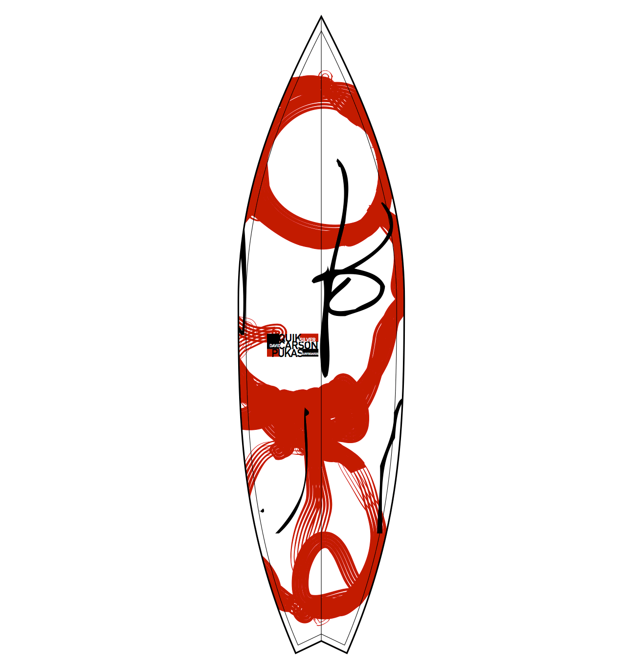
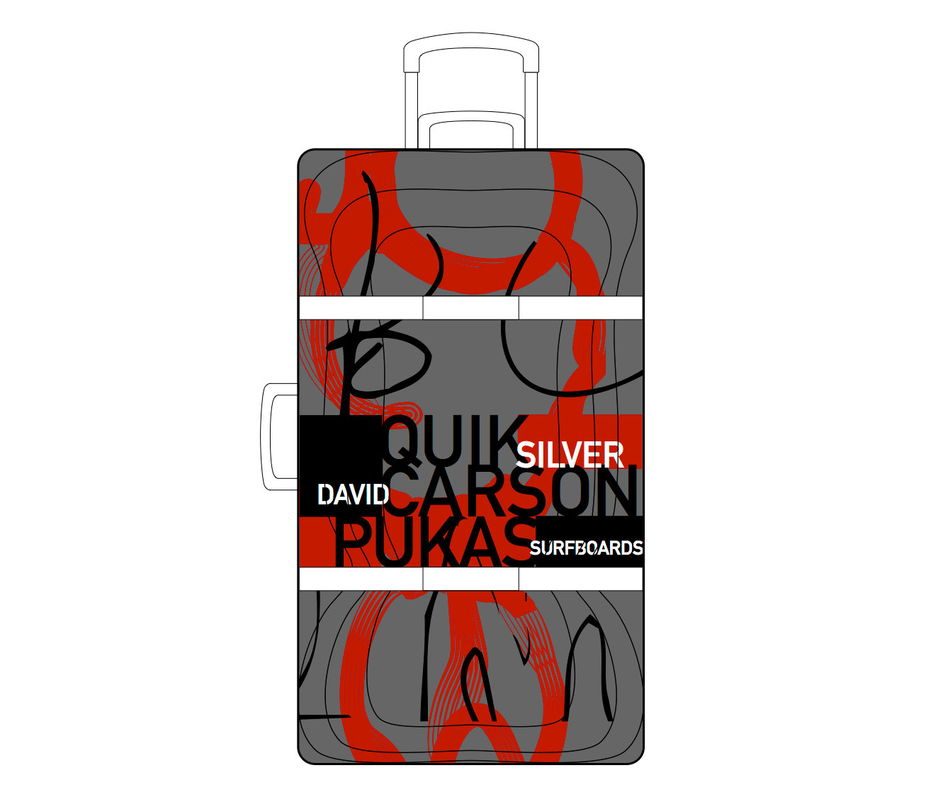
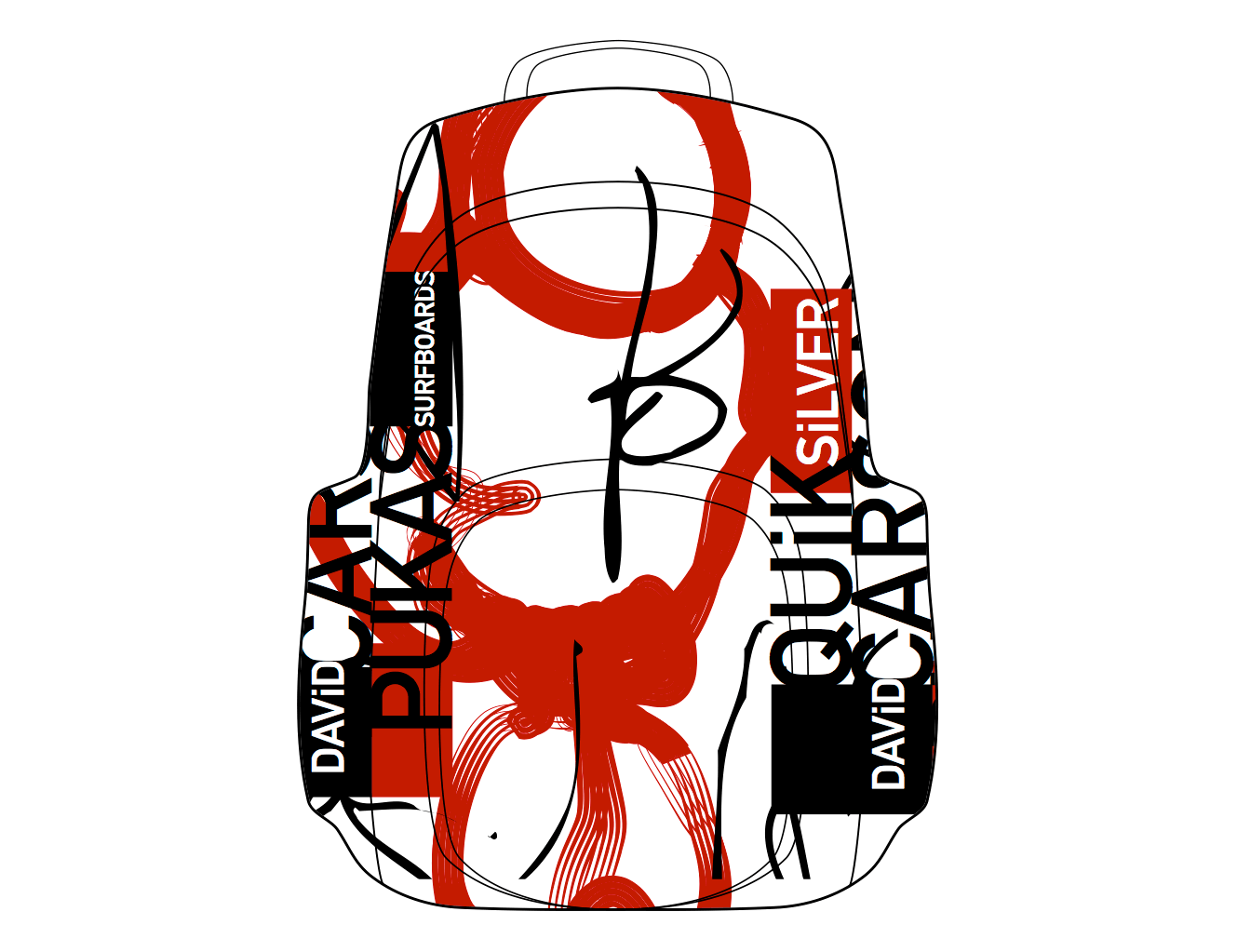
One of his latest artwork that I enjoyed is his designs for Quicksilver luggage. david is collaborating with quiksilver and pukas surfboards in europe for a line of carson designed luggage, backpacks, surfboards, wallets and more, available at over 600 stores in early 2010. What enjoy about the work is that he incorporates surfboarding into the luggage by using the same design.

Cited Sources:

Janine Rewell is a Helsinki-based illustrator and graphic designer. She studied graphic design at the University of Art and Design Helsinki and Rhode Island School of Design. Janine won the bronze Design Lion at the Cannes Lions International Advertising Festival 2009 and recently nominated by Print Magazine as one of the twenty best new visual artists of 2010. She is also awarded with the Junior Award 2010, the greatest national recognition for a young designer. In addition to taking part in many group exhibitions, she had her first solo exhibition in Barcelona in 2010. Inspired by surrealist painters, children's books, art deco, bright colors and the geometry of nature, Janine's designs are a enchanting mix of Scandinavian design and Slavic folk art.

One of Janines most successful pieces of work that I enjoy is her Illustrations for Nokia's Christmas campaign. Nokia Christmas campaign is annual competition which allows designers to bring together the spirit of Christmas and technology. Janines artwork won first place in 2009 and her work was displayed in the Wieden & Kennedy London magazine.

What I think of her work is that she compiles all of her ideas into on area which draw you into the artwork and makes makes you look closely to the piece to actually see whats going on. The design really has a Christmas feel to it by using familiar color and objects that relate to the occasion. when putting these backgrounds be hind Nokia cell phones they give them a gift-wrap present type presence.
Cited Sources:

My last designer is Jason Schulte. Jason Schulte is the founder and creator director of San Fransisco based "Office". Jason founded Office in 2003, and his primary goal was to introduce the art and craft of design with strategy and storytelling of advertising. Since then Schulte has made work for some oft the worlds most recognized companies, including Ebay, Coca-Cola, Apple, Disney, Target, and Adidas Golf. His work has been Internationally recognized by nearly every major graphic design competition and publication, and has appeared in museums exhibitions around the world. Schulte is also a directed study advisor at the San Francisco Academy of Art University, and Fast Company featured him as one of fourteen designers to watch in its Master of Design issue. He was raised in Green Mountain, Iowa and is a graduate of Iowa State University's College of Design. He lives in San Fransisco with his wife Jill Robertson who happens to be Office President.

Some of his work that I truly enjoy is Fanta World advertising campaign for Fanta one of the most popular sodas around the world. The Fanta team recognized that teens today are "global experience collectors," willing to try whats new in Tokyo or Sao Paolo. So they launched Fanta World - new brand that introduces teens to limited edition Fanta flavors around the world.

Office developed the new packaging system for Fanta World, aligned with the Fanta trademark system. Consistent with Fanta World’s adventurous spirit, the visual vocabulary evokes a sense of discovery. Each product – from Thai Mango to China Melon – has playful illustrations that identify the country and flavor. And the packages have a collectible feel to emphasize the limited time availability of each flavor.

What I think about his work is that that design definitely draw more of a teenage audience, by using vibrant color and playful pictures. But the key to the design was to use artwork that is familiar with the audience that is directly related to their Asian culture such as the use of the China Lion and China building structures.


Cited Sources:

2)


Monday, April 11, 2011

Patterns


http://www.illusionking.com/illusions/3-moving-patterns.jpg

I found this pattern on google images I like this pattern because This illusion consists of three patterns that are completely still. However, when looking at it, it seems as though it’s moving. which make this pattern unique in a way.


http://hi-android.info/wp-content/uploads/2010/08/Honeycomb400x400.gif

I got this pattern from google images, the reason I found this pattern interesting is because it shows there are unique patterns in nature. This pattern is a picture of a Bee Hive honeycomb and you can see many hexagon like figures evenly connected to each other.

Diamond Pattern Satin Fabric Texture Five Vital Black & White Photography Tips

http://media02.hongkiat.com/black-white-photography-tips/Diamond-Pattern-Satin-Fabric-Texture.jpg

I got this pattern from google images, i found this pattern interesting because it only uses the colors black and white. But the diamond like patterns combined with the black and white colors are both as equally important in giving this pattern rich textures.


http://ministryoftype.co.uk/images/files/guilloche-1.jpg

I got this pattern from google images. I found this patter very interesting because this pattern seems to have depth to it when looking from top to bottom the pattern goes from large to small which gives the image a tunnel like illusion.


CR01

so far I am really enjoying this class, I have learned so much about design that I didn't know before. The most interesting thing that I have found through the lectures is that how the evolution of the design process has came to be; showing how earlier years in design, things were designed big. But as time goes on designs began to become smaller. But as of today we are moving back forward to those days of big design. What I also found interesting is how chairs we a big business for design, and how the designs differed from one another, but served as the same function.

Sunday, April 3, 2011

Introductory

Whats up classmates, welcome to my blog. My name is Gered I am from Cleveland, Ohio, and I hope to get to know everyone from this class.

I am taking this course because have found it interesting. I am interested in what this course offers. I am looking forward to gaining more knowledge about design and its origins. I heard about this course from a friend; and the questions I may address are that how modern design compares to design in the past.